Manual
Mill
Mill
Mill
How do you encourage people to eliminate food waste?
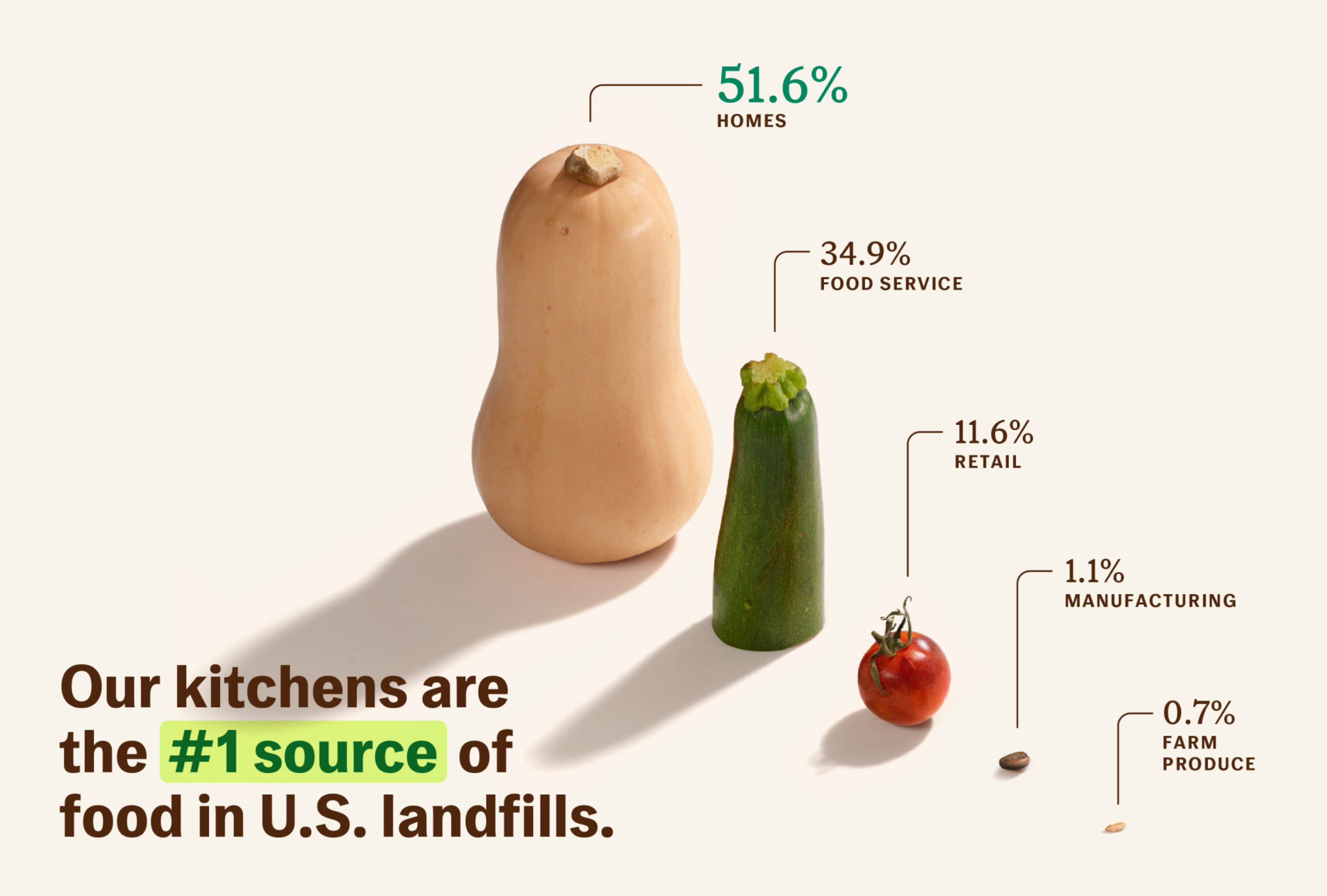
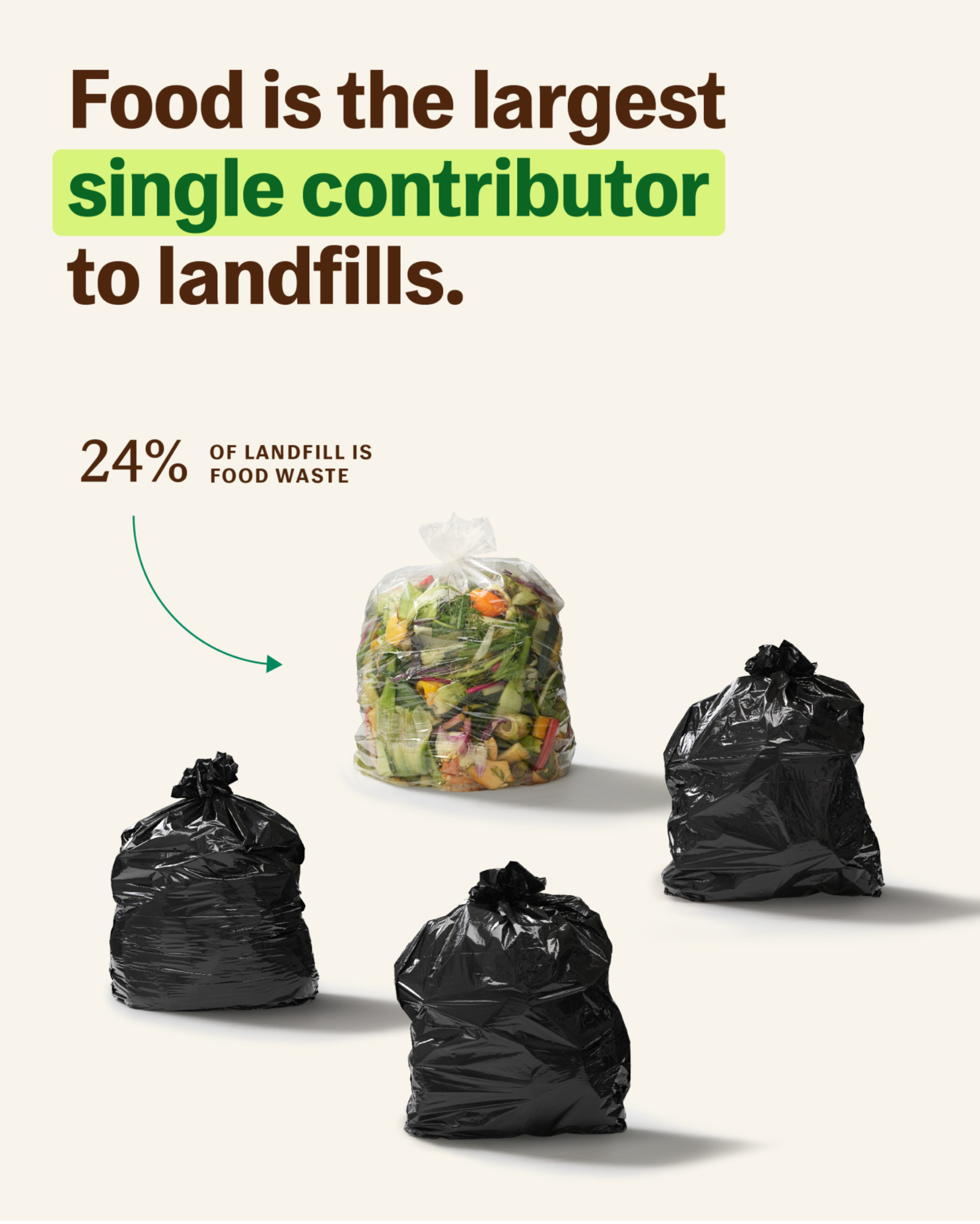
Every year, the United States wastes 54 million tons of food, the overwhelming majority of it going to landfills. Food scraps comprise 24% of landfills which produce methane—a greenhouse gas 80x more potent than CO2. We can all agree we need to waste less. Mill believes that your kitchen is one of the best places to start. Their mission? Not just to reduce greenhouse emissions but to end food waste for good. They utilize a membership-based model, providing a kitchen bin to dry, grind, and de-stink your food scraps at home, turning them into Food Grounds which are then shipped back to Mill and turned into chicken feed for farms.
While Mill’s waste management system is easy to use, the task at hand wasn’t so simple. We had to bring people’s attention to the urgent issue of food waste–not only needing to educate people about a little-known problem, but inspiring them to change their behavior. Manual was brought in to create a brand identity and visual storytelling strategy that informs, educates, inspires, and delights people to take action.
Our approach:
Celebrate the scraps
Whether it’s egg shells, carrot tops, or leftover spaghetti, most people don’t realize the things they throw away still have precious nutrients. By elevating the aesthetics of food scraps, we help people better see and understand their value.
Ground it in science
With all the greenwashing and overstated sustainability claims associated with consumer products, it’s tough to know what’s reliable information these days. It was important to keep storytelling rooted in science and numbers-based facts and figures to instill confidence in prospective customers.
Bring it full circle
While the kitchen bin is a great product, Mill does a lot more than dehydrate and grind food scraps—it completely redistributes their nutrients. We wanted to show people the fruits of their labor and the benefits of food going from farm-to-table and back-to-farm again.


The Mill logo combines simple, modern, elongated letterforms with a subtle millstone icon—a reference to the name and the underlying principle of grinding up food scraps. In this way, we allude to Mill’s new, innovative solution as well as agricultural technology and practices of the past.


The graphic language is inspired by a range of eclectic materials, including children's book illustrations, agriculture journals, and scientific diagrams.

A characterful sans serif and a bookish serif create a dynamic pairing. This combination gives the brand typographic flexibility for a wide range of messaging and communication across themes that span food, science, and agriculture. A rich and vibrant color palette, inspired by fruit, vegetables, and Food Grounds, keeps the brand upbeat and optimistic.

Infographics use multiple forms of visual representation. Simple linear diagrams help demonstrate Mill’s role in a larger food ecosystem, while close-up, stylized food photography calls attention to startling facts about food waste. Together, these elements create an engaging way to educate audiences and highlight the problems associated with food waste.


Photography captures both sides of Mill’s service—the ease of using the kitchen to create Food Grounds, and their distribution back to the farm. This allows people to better understand Mill’s impact on the entire food ecosystem and the direct benefits that come from not throwing food in the trash. Warm tones make lifestyle photography feel organic, vibrant, and optimistic, while close-up compositions put food scraps at the center of the story.


3D render images and animations showcase the bin's functionality—accentuating the clean, simple aesthetics of the product that allow it to sit beautifully in any kitchen environment.


Still life photography uses highly stylized compositions and stunningly detailed shots to elevate the “beauty” of food scraps and Food Grounds and help people see their intrinsic value.

Graphic illustrations are used to teach people what they can (and can’t) put in the Mill kitchen bin, while introducing a playful quality to communications.


Stationery and notecards reuse a commercial printer’s waste paper, rather than using new paper materials. By overprinting the Mill branding onto proof sheet offcuts, a beautiful, colorful, and abstract visual language is formed.


For company swag, a Mill logo is screen-printed directly onto ‘upcycled’ fabric items supplied by individuals on the Mill team. Nothing is procured, no material is used, and the swag becomes highly personal to the individual.


A big thank you to the Mill crew: Matt, Harry, Kristen, Rocky, Erin, Chris, and the broader team for your infectious optimistic energy.
“We’ve now had the pleasure to work with the Manual team on two breakthrough climate start-ups, Mill and Nest. Their incredible aesthetic, ability to capture the essence of new brands, and attention to detail are unmatched. The results speak for themselves.”
Matt Rogers, Founder & CEO, Mill.